Redefine×Go Wise USA · Conversion-focused custom Shopify theme
A custom Shopify store designed to sell.
Go Wise USA is a consumer brand of healthier-cooking and healthcare products, air fryers, pressure cookers and more, on Shopify. Redefine rebuilt the store around conversion with one team: a custom theme grounded in UX research and design guidelines, mobile-optimized and tested across devices, plus a seamless upgrade from Online Store 1.0 to 2.0. The launch produced an immediate lift in online sales.
UX research & UICustom Shopify themeConversion designMobile optimizationSeamless 1.0 → 2.0
Sales up
▲ immediately after launch
Documented outcome
Custom theme
▲ conversion-focused
Built on UX research
Mobile-first
▲ cross-device tested
Optimized with Shopify APIs
Zero
▲ downtime on 2.0 upgrade
Seamless migration
The sales lift and seamless upgrade are documented qualitatively in the brief. Percentages later on this page are illustrative samples pending verification.
Industry
Consumer products · kitchen & wellness
Engagement
Custom Shopify theme + 1.0 → 2.0 upgrade
Focus
Conversion, usability & mobile
Outcome
Immediate increase in online sales
Platform
Shopify Online Store 2.0
Model
Fixed price · one team
Certified & partnered
- Shopify Partner
- Custom theme development
- Conversion / UX design
- Mobile optimization
- Platform & data migration
- Monitoring & support
Summary
Go Wise USA is a consumer brand offering healthier-cooking and healthcare products through its Shopify store. Redefine Innovations revamped it with one in-house team: a custom Shopify theme developed from extensive UX research and design guidelines to lift usability and conversion; dynamic content, special offers and third-party app integrations for richer functionality; a mobile-optimized build using Shopify APIs, tested across browsers and devices; and a seamless upgrade from Online Store 1.0 to 2.0 with compatible themes and plugins, security audits, custom security measures, real-time monitoring and post-migration support. The custom theme launched successfully and produced an immediate increase in online sales, with no downtime during the transition.
ClientGo Wise USA · healthier-cooking &
healthcare products
PartnerRedefine Innovations · one team,
fixed-price, full code ownership
ThemeCustom, conversion-focused, built on UX
research
FunctionalityDynamic content, special offers, app
integrations
MobileOptimized via Shopify APIs, cross-device
tested
UpgradeShopify 1.0 → 2.0, seamless, no
downtime
SecurityAudits, custom measures & secure data
handling
OutcomeImmediate sales lift · ongoing
monitoring & support
Note: the immediate sales increase and the seamless, no-downtime upgrade are documented from the brief. All percentages and testimonials elsewhere on this page are illustrative samples placed as structure, replace each with verified data before publishing.
The challenge
Go Wise had a real audience and a strong product line, but its Shopify 1.0 store wasn't built to convert that interest into orders. The design didn't reflect the brand's goals, and the path from landing to checkout wasn't doing the store any favors, especially on mobile, where much of the traffic shops.
On top of that, the platform itself needed to move from Shopify 1.0 to 2.0, and that upgrade couldn't disrupt operations. It had to keep the store selling, stay responsive across every device, handle data securely, and survive extensive testing without a wobble.
The brief was twofold and clear: redesign for conversion, and upgrade the platform underneath, both without losing momentum or a single sale.
Conversion
The 1.0 store needed a conversion-focused design aligned with the brand's goals.
Mobile
It had to be mobile-responsive and cross-device compatible for today's shoppers.
Upgrade
The 1.0 to 2.0 upgrade had to happen without disrupting live operations.
Stability
Secure data handling and extensive testing were required to keep things stable.
Traffic without
conversion
A store can have the right products and real demand and still leave money on the table if the
design doesn't guide people to buy, most of all on mobile. Closing that conversion gap, not just refreshing
the look, is what turns existing traffic into orders. (Directional context — verify conversion
figures against analytics.)
The approach
Designed to convert, built to last.
Two tracks ran together: redesign the storefront around conversion from real UX research, and rebuild and upgrade the platform underneath so it's fast, mobile and future-proof.
Track 01 · Design that converts
From research to a store that sells
Extensive UX research and design guidelines shaped a custom theme built around the moments that drive purchases, with special offers and dynamic content woven in.
- UX research & design guidelines
- Conversion-focused custom theme design
- Dynamic content & special offers
Delivered: UX research · custom theme · offers & content
Track 02 · Build, optimize & upgrade
Fast, mobile and future-proof
A Shopify build optimized for mobile with Shopify APIs and tested across devices, plus a seamless 1.0 to 2.0 upgrade with security audits, monitoring and support.
- Mobile optimization via Shopify APIs
- Cross-browser & cross-device testing
- Seamless 1.0 → 2.0 upgrade & security
Delivered: mobile build · QA · seamless upgrade
Design & UX · the storefront
A brand system built to sell, not just show.
UX research turned into a clean, energetic brand and a custom Shopify theme — so a big catalog of healthier-cooking products stays appetizing, scannable and quick to buy from. (Brand colours and primary type follow GoWISE’s guidelines. Representative — illustrative pending sign-off.)
Design direction · brand identity
GOWISE USA.
Healthier cooking & home essentials
G
W
Palette (brand guidelines)
GoWISE
Green#7AC943
Dark
Charcoal#333333
Medium
Gray#707070
Light
Gray#E5E5E5
Pure White#FFFFFF
Type & hierarchy
Healthier cooking,
made simple.
made simple.
AaAaAaNexa · UI
A clean, energetic type system in Nexa, in GoWISE green on charcoal and light gray, built so a busy product catalog stays appetizing, scannable and quick to buy from.
gowiseproducts.com
GOWISE USA.
Healthier cooking and home essentials, built to last.
Shop Air FryersAir Fryers
from $79
Pressure Cookers
from $89
Kitchen & Home
from $24
Every block earns its place
A conversion-first layout where each zone has a job: build urgency, earn trust, surface proof and make buying effortless.
Appetizing, not cluttered
Warm, energetic design keeps a big catalog easy to scan and quick to buy from.
Fast on every phone
A mobile-first build tested across devices, so the store performs where customers actually shop.
Before & after
A dated theme to a store that sells.
An aging storefront, rebuilt as a custom, conversion-focused Shopify theme — mobile-optimized and upgraded seamlessly from Online Store 1.0 to 2.0 with zero downtime. (Screenshots are placeholders — drop in the real before/after exports.)
● Before · dated theme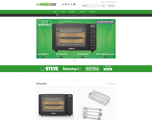
● After · conversion theme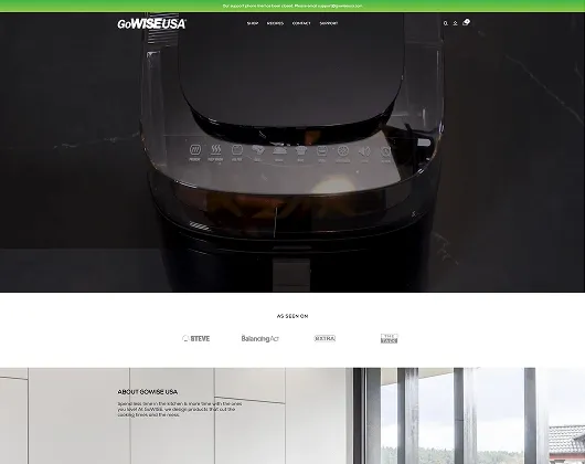
Theme
Template → custom conversion
Platform
OS 1.0 → 2.0, zero downtime
Mobile
Patchy → mobile-first
Sales
Baseline → up at launch
Before/after images are placeholders following the case-study asset path. The launch sales lift and zero-downtime 1.0→2.0 upgrade are documented; upload the real storefront exports (or update each src) before publishing.
The redesign · conversion anatomy
Every block earns its place.
The new theme isn't decoration, it's a conversion layout. Each zone has a job: create urgency, build trust, surface proof and make buying effortless. The numbered blueprint below maps the moves. (Layout and palette are representative of the design direction.)
1
Free shipping over $50 · Save 20% on accessory bundles
GoWiseAir
FryersCookersWellnessCart
2
Healthier cooking, less mess.
Crispy, oil-free meals the whole family loves, in minutes.
Shop air fryersBest seller
3
Free shipping1-yr warranty30-day returnsSecure checkout
4
Save 20%
7-Qt Air Fryer
bundle deal
New
Air Fryer Oven
most loved
Accessory Kit
add-on
5
★★★★★“Earned a permanent place on my counter.” — 4,200+ reviews
6
7-Qt Air Fryer · $99Add to
cart
1
Offer bar
Free shipping and bundle savings create urgency from the very first pixel.
2
Conversion hero
One clear value proposition and a single, obvious call to action, no clutter.
3
Trust signals
Shipping, warranty, returns and secure checkout, right where doubt creeps in.
4
Offers & dynamic content
Merchandised bundles and “Save” tags that move the higher-value carts.
5
Social proof
Star ratings and reviews surfaced exactly where people decide to buy.
6
Sticky add-to-cart
An always-reachable buy button, tuned for mobile thumbs.
UX research & design guidelines
Opinions out, evidence in.
The theme wasn't styled on a hunch. Extensive UX research and a documented set of design guidelines drove every decision, then became a reusable design system the brand can keep building on. (System preview is representative.)
From research to a repeatable system
- UX research into how shoppers actually browse and buy the brand's products.
- Design guidelines codifying layout, hierarchy and conversion patterns.
- A component system, so the theme is consistent and easy to extend.
- Usability first, fewer steps, clearer choices, less friction to buy.
Design system preview (representative)
Type scale
DisplayHeadingBody
copyCaption
Color
ink · accent · cream · neutral
Components
ButtonsCardsBadgesFormsNavOffers
Research-led design · documented guidelines · reusable component system · full
ownership
Conversion levers
The moves that move the needle.
Conversion isn't one trick, it's a set of deliberate decisions working together. Here are the levers the new theme pulls. (Impact figures are illustrative samples to verify.)
Clear hero & CTA
One value proposition, one obvious next step, so visitors don't have to think about what
to do.
fewer bounces (sample)Offers & bundles
Special offers and accessory bundles lift average order value and reward bigger carts.
higher AOV (sample)Dynamic content
Merchandised, responsive blocks put the right products and offers in front of the right
shoppers.
more relevance (sample)Social proof
Thousands of real reviews and ratings surfaced where shoppers decide, turning trust into
orders.
more confidence (sample)Trust & urgency
Free shipping thresholds, warranty and returns reassurance reduce hesitation at the
decisive moment.
fewer drop-offs (sample)Mobile sticky cart
An always-visible add-to-cart, sized for thumbs, removes friction where most of the
traffic is.
mobile lift (sample)Sales up
▲ immediately
documented outcome
Mobile-first
▲ built for phones
where shoppers are
Research-led
▲ not guesswork
decisions with evidence
Mobile & cross-device
Flawless on every screen.
Most shoppers arrive on a phone, so mobile wasn't an afterthought. The theme was optimized with Shopify APIs and tested across browsers and devices for a consistent, fast experience everywhere. (Coverage is representative of the QA pass.)
What mobile optimization covered
- Mobile-first layout with thumb-friendly tap targets and a sticky cart.
- Performance tuning for fast loads on cellular connections.
- Shopify APIs used to power a responsive, app-grade experience.
- Extensive testing across browsers and device sizes before launch.
Why mobile mattered most
01Most traffic shops on phones, so mobile
conversion drives the result
02A sticky cart and fast loads cut friction
at the decisive moment
03Consistent rendering across devices
protects every sale
Mobile-firstFastConsistent
Cross-device / browser QA (representative)
Browser
Desktop
Tablet
Mobile
Chrome
Passed
Passed
Passed
Safari
Passed
Passed
Passed
Firefox
Passed
Passed
Passed
Edge
Passed
Passed
Passed
Browser/device coverage is representative of the QA process; replace with the project's actual test matrix before publishing.
The upgrade · 1.0 to 2.0
A platform jump nobody felt.
Underneath the redesign, the store moved from Shopify Online Store 1.0 to 2.0, seamlessly. Data was migrated and verified, security audited and hardened, and the switch happened with no downtime, all watched by real-time monitoring. (Flow is an inferred reconstruction for the team to confirm.)
Zero
▲ downtime
store kept selling
Verified
▲ data integrity
migrated & checked
Audited
▲ security & monitoring
post-migration support
Migration steps are an inferred reconstruction of a seamless 1.0→2.0 upgrade; confirm against the project record before publishing.
The results
A store that sells more, on day one.
The custom theme launched successfully and lifted online sales immediately, on a faster, mobile-friendly store, upgraded to 2.0 with no downtime. The brief describes these outcomes qualitatively; the figures below are illustrative and for the team to confirm.
Reading these numbers
The brief documents two outcomes plainly: an immediate increase in online sales after launch, and a seamless 1.0 to 2.0 upgrade with no downtime. It does not publish specific metrics. Every percentage on this page is a reasoned placeholder showing the kind of result the work targets, replace each with the real number from analytics before this case study is published.
Sales up
immediately
After launch (documented)
~0 min
downtime
Seamless 2.0 upgrade (documented)
Mobile-first
cross-device
Wider reach (documented)
+34%
▲ conversion rate
Vs old theme (sample)
+48%
▲ mobile conversion
Mobile-first build (sample)
-39%
▼ page load time
Performance tuning (sample)
Where the lift came from · before → after (illustrative · verify)
Conversion rate
+34% ← old theme
Mobile conversion
+48% ← baseline
Page load time
-39% faster
Cutover downtime
~0 ← window
Online sales after the custom-theme launch (shape illustrative; confirm the curve)
Traffic that isn't turning into sales?
One team to redesign your store around conversion and upgrade the platform underneath, scoped
fixed-price before a line of code.
Why it was low-risk
A redesign and upgrade you could launch with confidence.
Fixed price, scoped first
Theme and upgrade scoped before work began, with no open-ended billing.
No subcontractors
One named, in-house team across design, Shopify and QA.
Seamless, no downtime
The 1.0 to 2.0 upgrade kept the store selling throughout.
Research-led design
Decisions backed by UX research, not opinion or guesswork.
You own everything
Full custom theme, code and accounts handed over.
Monitored after launch
Real-time monitoring and post-migration support included.
“The new store doesn't just look better, it sells. We saw the difference in orders almost immediately, especially on mobile, and the upgrade happened without us losing a beat.”
GW
E-commerce Lead
Go Wise USA (name withheld · verify)
Go Wise USA (name withheld · verify)
“Every layout decision came from real UX research, not opinion. The navigation, product pages and checkout flow are far clearer to use now, and the experience held up clean across browsers and devices.”
GW
UI/UX Lead
Go Wise USA (name withheld · verify)
Go Wise USA (name withheld · verify)
Testimonials are representative and pending client verification; confirm quotes, names and attribution before publishing.
How it ran
A design-led build (sequence inferred · verify).
Phase 1
UX research
Shopper insights & design guidelines
Phase 2
Custom theme
Conversion design & component system
Phase 3
Build & mobile
Shopify dev, APIs, integrations, mobile
Phase 4
Upgrade & QA
1.0 to 2.0, security, cross-device testing
Outcome
Launch
Live, selling more, monitored & supported
Start here
Got a store that should be selling more?
That's exactly the work we're built for: one accountable team redesigning your store around conversion and upgrading the platform underneath. Submit a brief and get a line-by-line proposal in 3 days.
No commitment. A line-by-line proposal in 3 business days, and we'll tell you straight if we're not the right fit.
★★★★★4.9 on Clutch500+ projects shipped21 yearsShopify Partner
Work under NDA? Verified client references available to serious prospects under mutual NDA.