Redefine×On The Hash · UX/UI design & design system
An app designed to keep people coming back.
On The Hash is a mobile app that teaches American football, plays, formations and film, through a fun, competitive experience. Redefine designed its interface with one team: a user-centered UX/UI overhaul validated by research and A/B testing, and a scalable design system spanning the end-user app and the admin interface, built to make the product more usable, consistent and engaging over the long run.
UX & UI designDesign & usability researchA/B testingDesign systemApp + admin
Design
▲ usability & clarity
Modern, intuitive interface
Design system
▲ one shared library
App & admin, consistent
Validated
▲ research + A/B tested
Evidence, not opinion
Engagement
▲ up & sustained
Long-term retention
Qualitative outcomes from the engagement brief. Percentages and sample screens later on this page are illustrative pending verification.
Product
Mobile app · football learning & game
Engagement
UX/UI design + design system
Scope
End-user app, admin interface & system
Method
Research, usability & A/B testing
Outcome
Higher engagement & retention
Model
Fixed price · one team
Disciplines
- UX & UI design
- Mobile app design
- Usability research
- A/B testing
- Design systems
- Dev support
Summary
On The Hash is a mobile app focused on an engaging, intuitive experience for learning American football. Redefine Innovations designed its interface with one in-house team to improve usability, consistency and long-term engagement. The work applied a user-centered design process: research into user behaviors, preferences and pain points; UI guidelines for clarity, accessibility and consistency; modern UI elements introduced without compromising usability; and usability and A/B testing to validate decisions. A comprehensive design system was built to keep the end-user app and the admin interface consistent and easy to evolve. The result: a more appealing, intuitive experience that earned strong positive feedback and lifted engagement and retention.
ProductOn The Hash · football learning & game app
PartnerRedefine Innovations · one team, fixed-price, full ownership
designUser-centered UX/UI for usability & engagement
ResearchBehaviors, preferences & pain points studied
ValidationUsability testing & A/B testing of decisions
SystemDesign system across app & admin interface
ConsistencyImproved maintainability & brand cohesion
OutcomeStrong feedback, higher engagement & retention
Note: the positive feedback, engagement and retention gains and the design system are documented qualitatively in the brief. All percentages, sample screens and testimonials elsewhere on this page are illustrative, replace each with verified detail before publishing.
The challenge
On The Hash had a genuinely fun idea, learning football by making the call, but its interface was getting in the way. The experience needed to feel modern and engaging, yet stay simple enough that a new fan could pick it up and a regular could keep coming back.
That's the hard part of interface design: balancing an innovative, distinctive look with real usability. Push the visuals too far and it confuses; play it too safe and it bores. On top of that, the app needed to feel consistent across screens and platforms, and every design decision had to earn its place against actual user behavior, not just taste.
The brief was clear: design for engagement and clarity together, validate it with research and testing, and put a system in place so the product stays coherent as it grows.
Balance
Make it innovative and engaging without sacrificing intuitive usability.
Consistency
Keep the experience coherent across screens and platforms.
Evidence
Validate decisions with usability and A/B testing, not opinion.
Scale
Put a design system in place so the product stays consistent as it grows.
A clunky UI loses the user
For an app whose whole value is engagement, friction in the interface is the quiet killer, people don't complain, they just stop opening it. Designing for clarity and momentum, and proving it with testing, is what turns first-time curiosity into a lasting habit. (Directional context — verify engagement and retention figures against analytics.)
The approach
Bold where it helps, simple where it counts.
Two tracks ran together: ground every decision in research and testing, and turn the winning decisions into a reusable design system so quality scales with the product.
Track 01 · Research & validate
Decisions earned, not guessed
A user-centered process: study real behaviors and pain points, design against them, then validate with usability and A/B testing before anything ships.
- Research into behaviors, preferences & pain points
- Usability testing & A/B testing to validate
- Refinement from real feedback, not opinion
Delivered: research · usability & A/B testing · refinement
Track 02 · Design & systematize
A modern UI on a real system
Innovative UI aligned with current trends, applied through UI guidelines for clarity and consistency, then codified into a design system shared by the app and admin.
- Modern, engaging UI that stays intuitive
- Comprehensive, scalable design system
- Consistency across the app & admin interface
Delivered: UI design · design system · app + admin
Design & UX · the app
One brand, built to make the call.
A sporty, confident brand system carried across the player app and admin — so learning football feels like a game, and every screen has one obvious move. (Brand colours and primary type follow On The Hash’s guidelines; one supporting tone is derived. Representative — illustrative pending sign-off.)
Design direction · brand identity
ON THE HASH.
Learn football · make the call
O
T
H
Palette (brand guidelines · supporting tone derived)
Midnight Navy#151521
Electric Lime#39FF14
Cool Gray#ACAAB2
Soft Mist Gray#E6E4ED
Navy Deep · derived#0E0E17
Type & hierarchy
Learn the game.
Make the call.
Make the call.
AaAaAaStratumNo1 · UI
A bold, sporty type system in StratumNo1 with electric-lime accents on midnight navy, built for fast, confident decisions — one clear action per screen.
On The Hash · iOS app
ON THE HASH.
Learn American football through a game you’ll actually want to play.
Play nowLearn
Lessons & film
Play
Make the call
Compete
Streaks & rank
One clear call per screen
Every screen has a single obvious action, so starting takes no thought and nothing competes for attention.
Progress you can feel
Streaks, challenges and rank turn one session into a habit and keep players coming back.
App and admin, one system
A shared brand and component system keeps the player app and the admin interface consistent and fast to evolve.
See it live:Visit onthehash.com
Before & after · screens
Old screen to new, side by side.
The cluttered original beside the rebuilt, single-focus experience — the same app, far clearer to use. (Screenshots are placeholders — drop in the real before/after exports.)
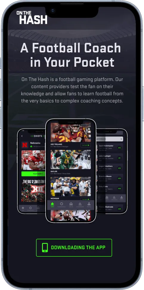
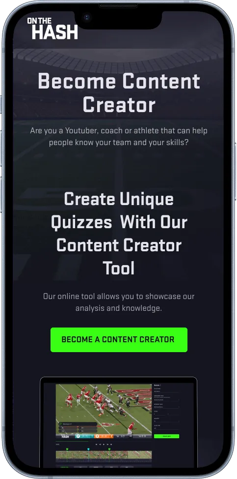
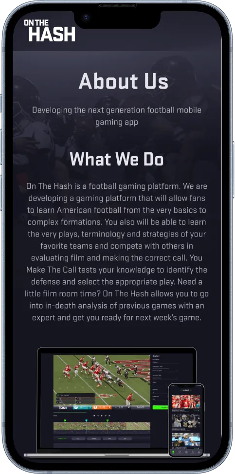
Before/after images are placeholders following the case-study asset path. Upload the real app exports (or update each src) before publishing.
The design system
Not just screens, a system.
Beyond individual screens, the real payoff is a shared design system: foundations, components and guidelines that keep the app and admin consistent and make every future change faster. (Tokens and components are representative of the system.)
Foundations
Color
brand · surfaces · semantic
Typography
DisplayTitleBody textLABEL
Spacing & grid
481624
Radius & elevation
soft corners · layered depth
Components
Buttons
PrimarySecondaryGhost
Inputs & controls
Search plays…
Notifications
Selection chips
OffenseDefenseSpecialBeginnerPro
Card & nav
One system, every surface
- Reusable components mean the same button, card and input behave the same everywhere.
- Faster updates, change a token once and it ripples through the whole product.
- Brand cohesion across the user app and the admin interface, from one source of truth.
Research & usability
We watched, then we designed.
Every big move started as something we observed real users do. Research turned behavior and pain points into specific design decisions. (Insights are representative of the research process.)
We observed
New users froze on the home screen, unsure where to start.
→ insight
Too many competing actions diluted focus. So we led with one clear primary action, “Make the call,” on open.
We observed
People dropped off mid-session and didn't return the next day.
→ insight
Progress was invisible, so there was nothing to come back for. So we surfaced streaks, challenges and rank.
We observed
Screens felt subtly “off” from one to the next.
→ insight
No shared patterns meant drifting styles. So we built a design system for one consistent, trustworthy feel.
Observations and insights are representative of the research process; replace with the project's real findings before publishing.
A/B testing
Opinions decided by data.
Where a decision was contested, we tested it. A/B testing settled the debates with evidence and pointed to the next refinement. (Variants and results are illustrative samples to verify.)
Home screen: one focused action, or many entry points?
Variant A
A grid of tiles offering every section at once, learn, quiz, compete, profile.
baseline
Winner
Variant B
A single, prominent “Make the call” action with everything else one tap away.
▲ more sessions started (sample)
Validated: a focused entry point lowered the effort to start and increased engagement.
Play screen: text-only options, or a visual field?
Variant A
The down-and-distance and choices shown as plain text buttons.
baseline
Winner
Variant B
A visual field with hash marks and tap-to-call options that feel like the game.
▲ faster, more enjoyable (sample)
Validated: a visual, game-like layout was both clearer and more engaging than text alone.
App & admin · one system, two surfaces
The team's side, designed too.
The scope wasn't just what players see. The admin interface, where the team manages plays, lessons and users, was built from the same design system, so the whole product is coherent and easy to run. (Admin view is a representative reconstruction.)
On the Hash AdminContent manager
8.4k
Active users (sample)
240
Plays & lessons
31k
Sessions / wk (sample)
12
In review
Content
Type
Status
Cover 2 — Defensive Basics
Lesson
Published
Read the Blitz
Challenge
Published
RPO Concepts
Lesson
Published
Week 9 Film Set
Quiz
Scheduled
Why the admin mattered
- Same design system means the admin feels like part of the product, not a bolted-on tool.
- Easier content ops, the team ships plays, lessons and challenges with less friction.
- Consistency end to end, what the team builds matches what players experience.
The results
Loved more, and used more.
The work delivered a more appealing, intuitive experience that earned strong positive feedback and lifted engagement and retention, on a design system that keeps it consistent as it grows. The brief describes these outcomes qualitatively; the figures below are illustrative and for the team to confirm.
Reading these numbers
The brief reports qualitative outcomes, strong positive feedback, increased engagement and interaction, better long-term satisfaction and retention, and a consistent design system, but no published metrics. Every percentage on this page is a reasoned placeholder showing the kind of result the work targets. Replace each with the real number from analytics and research before this case study is published.
designed
app & admin
Modern, intuitive UI (documented)
Design system
scalable
Consistency & maintainability (documented)
Strong
positive feedback
From users (documented)
+46%
▲ feature engagement
Vs old UI (sample)
+38%
▲ day-7 retention
Stickier experience (sample)
4.7★
▲ app rating
Post-design (sample)
Where the lift came from · before → after (illustrative · verify)
Feature engagement
+46% ← old UI
Day-7 retention
+38% ← baseline
Task success (usability)
up ← tested
Design consistency
system ← ad-hoc
Engagement & retention after launch (shape illustrative; confirm the curve)
Great idea, interface holding it back?
One team to design your product around real users and build the design system that keeps it consistent, scoped fixed-price before a pixel.
Why it was low-risk
A design you could defend with evidence.
Fixed price, scoped first
The design work and system were scoped before work began, with no open-ended billing.
No subcontractors
One named, in-house team across research, UX/UI and dev support.
Tested, not guessed
Decisions validated with usability and A/B testing before shipping.
A system, not a one-off
Reusable foundations make future changes faster and cheaper.
You own everything
Full design system, source files and guidelines handed over.
Built with your devs
Development support so the design ships the way it was designed.
“The new design just clicks. People get it instantly, they keep coming back, and the feedback has been the best we've ever had. It finally feels like the product we imagined.”
JC
Jordan Cole
Founder, On The Hash
Founder, On The Hash
“The design system changed how we work. Our admin and app finally match, and shipping new lessons is so much faster because everything's already a component.”
RB
Riley Brooks
Product, On The Hash
Product, On The Hash
How it ran
A research-led design process (sequence inferred · verify).
Phase 1
Research
Behaviors, preferences & pain points
Phase 2
UI design
Concepts, guidelines & modern UI
Phase 3
Test & refine
Usability & A/B testing
Phase 4
Design system
App + admin, components & tokens
Outcome
Ship & support
Higher engagement, dev support
Start here
Got a product that should be easier to love?
That's exactly the work we're built for: one accountable team researching, designing and systematizing your product so it's clearer, more engaging and consistent everywhere. Submit a brief and get a line-by-line proposal in 3 days.
No commitment. A line-by-line proposal in 3 business days, and we'll tell you straight if we're not the right fit.
★★★★★4.9 on Clutch500+ projects shipped21 yearsUX, UI & design systems
Work under NDA? Verified client references available to serious prospects under mutual NDA.