UI/UX design services that turn frustration into revenue
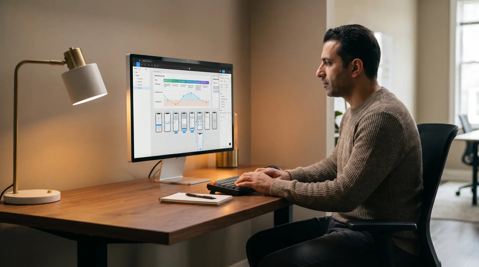
Every friction point in your product costs you a customer. Redefine is a UI UX design agency. We run user research, build wireframes, test prototypes, and deliver a complete Figma handoff. Your product ships faster. Your users stay longer.
What every engagement includes
User research: interviews, surveys, heatmaps, session recordings
Information architecture and user flow documentation
Lo-fi wireframes through high-fidelity interactive prototypes
WCAG 2.1 AA accessibility built into the design system from day one
Full Figma source file with component library at handoff. Yours to keep.

Bad user experience is not an inconvenience. It is a revenue leak.
88%
of users never return after one bad experience
Source: Sweor. First impressions form in 50ms. Poor design ends relationships before they start.
$100
back for every $1 spent on user experience
Forrester Research. UX investment has one of the highest measurable ROIs in digital.
70%
of digital projects fail due to poor user adoption
Source: McKinsey. Your team builds it. Users never use it. That is a UX problem.
What teams say before engaging Redefine
"Our conversion rate was flat for six months. We kept adding features. Users kept dropping at the same point. We had no idea what they actually wanted."
A SaaS product team before starting a UX audit with Redefine. That is a UX problem. Not a product problem. Research finds the exact drop point. Then we fix it.
What happens when you skip UX investment
- Users drop before checkout. Your team guesses why.
- Development builds the wrong screen. Rework doubles the sprint cost.
- Support tickets pile up because navigation breaks. The product is fine. The UX is not.
- Accessibility gaps create legal liability and cut off buyers who want to convert.
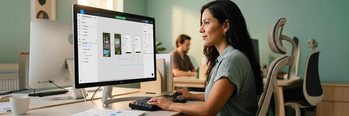
Eight questions. Sixty seconds. See where your UX is losing revenue.
Scroll through the checklist. Check every statement that is true for your product. Your UX score and a service recommendation update on the right in real time.
Users find what they need in 3 clicks or fewer
Navigation built around task completion, not your internal org chart
Your mobile experience matches or beats your desktop
Most of your buyers are on mobile. A poor mobile experience loses them first.
Key pages load in under 2.5 seconds on mobile
Each extra second of load time cuts conversion rates by 4.42% (Portent, 2023)
Every page has one clear action you want the user to take
When everything is a priority, nothing gets clicked
Your site meets WCAG 2.1 AA accessibility standards
Accessibility failures exclude paying customers and create legal exposure
You have run user testing in the past 12 months
Internal opinions about design are not a substitute for real user behavior
Developers build from a Figma design system
Without a shared system, every release introduces UI inconsistency
Your checkout or signup completes in fewer than 5 steps
Each added step drops completion rate. Five steps is already pushing it.
Check items above. Your audit preview appears here as your score builds.
Your UX has critical gaps that cost you conversions daily
Recommendation
Most audits surface 8 to 12 specific findings in two weeks. You get a line-by-line fix list, not a general report.
You have gaps your competitors will find before you do
Recommendation
A targeted sprint fixes specific drop points without rebuilding what works. Typical engagement: 4 to 6 weeks. Measurable conversion lift at the end.
Strong foundation. Optimization is your next revenue move.
Recommendation
Prototype testing and A/B iteration will find the remaining conversion lift your current UX is leaving on the table.
The UI UX deliverables your dev team can build from on day one
0+
Research methods in every project
We run interviews, surveys, heatmaps, session recordings, and prototype tests. Design decisions trace to user behavior. Not guesswork.
0 rounds
Wireframe iterations, included
We start with rough sketches and refine to high-fidelity screens. You review and approve between every round. Nothing moves forward without your sign-off.
AA built in
Accessibility from wireframe one
We design accessibility into every component from the first screen. Color contrast, focus states, and ARIA labels are specified before any pixel is final.
0%
Every component in the Figma handoff
Your dev team receives every state, every variant, every interaction. They build from a system, not a guess. Extensions are easy because the architecture is clean.
Weekly
Sprint reviews, every week
You see every deliverable as it develops. We flag decisions early. You give feedback before it costs time to change.
Before dev
Prototype testing stops expensive mistakes
We test interactive prototypes with real users before your team writes a line of code. Bugs in Figma take minutes to fix. Bugs in production take sprints.
See user experience case studiesOne research-led redesign. A brand that now does $30M a year.
Revenue outcome
$0M
Annual revenue after redesign
BigCommerce platform, rebuilt from UX research up
Research first
Before one screen
User research and design guidelines set before any wireframe began
Every page decision traces to a verified user insight
Personalization
Custom monogram feature
Built into the product flow, not added on top
Drove measurable increase in average order value

Peekawhoo
Ecommerce · BigCommercePeekawhoo sells customizable products with a strong personalization angle. Their reputation is built on the product experience itself.
The problem
Their existing platform blocked personalization at the product level. Inventory management created friction that reached customers. The brand needed a full UX rethink to match their growth targets.
What we delivered
A custom BigCommerce store built from in-depth user research and structured design guidelines. We designed and built a monogram personalization feature directly into the product flow. Backend operations and inventory management were restructured alongside the frontend. The result: a platform that earns the brand's personalization promise.
Primary service
User Experience and User Interface Design
Platform
BigCommerce
Revenue outcome
$30M annually
Key driver
Research-led user experience + personalization
What a research-led UI UX agency delivers versus what most agencies skip
Most agencies go straight to wireframes. They skip research. They skip testing. You find out in Sprint 3 when rework starts.
User research before wireframes. Always.
Every design decision traces back to a verified user finding
Prototype testing with real users before development starts
Validated flows go to dev. Failing assumptions go back to Figma.
WCAG 2.1 AA accessibility in every component
Specified at design time. Tested at QA. No remediation bills after launch.
Full Figma source file at close. Yours forever.
Your developers and future designers can build and extend from it with no dependency on us.
Scope and timeline in writing before Sprint 1 begins
No mid-project surprises. Changes are repriced and approved in writing before we act.
Weekly sprint reviews. You see every deliverable live.
Short feedback loops mean misalignment surfaces in days, not months.
Wireframes built from stakeholder preferences
Design reflects internal opinions. Not real user behavior.
No prototype testing before handoff
Assumptions ship to production. Rework costs arrive in Sprint 3.
Accessibility added at the end, or skipped
Post-launch remediation costs 50 to 100 times more than designing it in (Deque Systems)
Figma files retained or locked to a subscription
You pay again to extend a design system you already paid to build.
Hourly billing adds cost uncertainty every week
Scope creep shows up on the invoice. Not in the brief, where you could have stopped it.
Biweekly updates, no sprint-level visibility
Misalignment builds for weeks before anyone catches it.
What buyers ask before starting a UI UX design project
UX design defines structure, flow, and logic. It answers how a user moves through a product. UI design defines how it looks: typography, color, component styles, interaction states, and visual hierarchy. The two are sequential. UX research and architecture come first. UI is built on that foundation. Skip the research step and you get a beautiful interface users cannot navigate.
A focused engagement for one product area, such as a checkout flow or onboarding, runs 4 to 6 weeks. A full product redesign with research, information architecture, wireframes, prototypes, and high-fidelity handoff runs 8 to 14 weeks. We agree the timeline in the proposal before Sprint 1 begins. UI design does not start until UX wireframes are reviewed and approved.
We run the research as part of the engagement. Methods are scoped in your brief: user interviews, usability testing, heatmap analysis, session recordings, or survey design. If you have prior research, we review it and fill the gaps. If you have none, we start from scratch. Research findings are documented and handed off with design files at close.
At close you receive: the full Figma source file with every component, variant, and interaction state; design system documentation covering color tokens, typography, spacing, and usage rules; user research synthesis documents; user flow diagrams; and a recorded walkthrough session for your dev team. Everything is yours to keep. No subscription. No access dependency. No hostage files.
We scope pricing before any work begins. Submit a brief and we return a line-by-line proposal covering each phase within 3 business days. No hourly billing mid-project. No scope creep charges without your written approval first. If you want to understand investment ranges before submitting a brief, see our design pricing page.
We take on fewer projects so we can go deeper on each one
- Ecommerce brands losing buyers at the same point in every funnel
- SaaS products with onboarding drop-off or low feature adoption rates
- Teams that need WCAG 2.1 AA accessibility compliance and do not have it yet
- Product teams that want research-backed design decisions, not internal preference
- Development teams that need a complete, production-ready Figma system
- Teams that need a logo or quick banner refresh this week
- Projects where design is decided by one executive who is not available for weekly reviews
- Teams looking for templated design with no research phase and no iteration
- Briefs where the final design is already decided before research starts — we will not change what you want us to build, and we will not pretend research matters when the outcome is pre-determined
Not sure whether you are a fit? Tell us your situation honestly. We will give you a straight answer. Submit your brief →
No commitment. No pitch. Just a scoped proposal in 3 days.
Describe your product and the UX problem you need solved. We review every brief personally and return a line-by-line proposal within 3 business days. Keep it regardless of your decision.
Call within 48 hours
A senior UX team member reads your brief and calls to clarify scope. No sales rep. No script.
Scoped proposal in 3 days
Phase-by-phase breakdown with timeline and investment. Yours to keep either way.
Sprint 1 within 1 week of sign-off
Research starts the week you sign. No queue. No delay.
Your team spends 3 to 4 hours a week with us. One sprint review. Async feedback on deliverables. A final sign-off at handoff. We handle everything between.
Call in 48 hours. Proposal in 3 days. Sprint 1 in 1 week.